So here is the craziest thing I have ever heard and it might be different in other states or cities. I was in a Starbucks a few weeks ago in Boston and a man walked in with two empty Ethos water bottles(water Starbucks sells to help give clean water to third world countries) in his hand. He asked the Barista where he could recycle them and she informed him and the 900 other people in the store that Starbucks in Boston doesn’t recycle. OOPS!! I was under the impression that Starbucks was this recycling environmental friendly coffee megalith. At least the land fills in those third world countries won’t be full of Ethos water bottles, green platic straws and ice venti Americano cups.
You are currently browsing the monthly archive for July 2008.

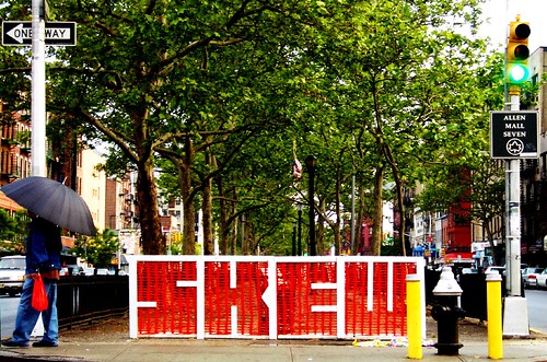
skew, originally uploaded by wacky doodler.
Super creative use of advertising/graffiti/branding. Genius.
Watch your mouth kid, or you’re gonna find yourself floating home. We’ll be safe enough once we make the jump to hyperspace. Besides, I know a few maneuvers. We’ll lose em’! By the way where the fuck is the corner of Aaaaaaaarrrgh and Rawwr, raaar?
So I was thinking about you in the tub, yeah you . I don’t know ass up? Cool, cool naked would be best.
This is so big, so bold, and so fresh.

bts, originally uploaded by BayTruthSeeker {ffsc}.
Brand consistency. In it’s illest form.

You and Me, originally uploaded by Mr Pinks.
This si an awesome example of using negative space in your designs. SKILLS son SKILLS.

, originally uploaded by A painful muscle spasm especially in the neck.
Like i said a million times, branding and brand consistency is the name of the graffiti game. Plus that good ol’ tryck of using an existing brands cache to elevate yours always draws attention. CRYCK is a master of this.

photo-grande-amose, originally uploaded by Veuch – Manzi.be.
This is amazing use of color and line weight.

triste450, originally uploaded by Veuch – Manzi.be.
This is beautiful. I love the use of the loose lines and the delicate white paint.


